
Which types of urban roadways are the most dangerous? Major arterial or minor arterial? Freeway or local street? The field of motor-vehicle safety statistics is more than a century old. One would expect such a mature field to have settled the basic question of the best way to report fatality risk. But that’s not the case, and what’s more, the most common method of reporting risk may be mathematically invalid. We may be getting an incorrect understanding of the types of roadways that have the highest fatality risk.
Engineers and traffic officials often say freeways are the safest roadways and local streets are the most dangerous. That fits the view of mainstream engineering, which points out that local streets have the closest spacing of driveways and intersections, and therefore the densest occurrence of “conflict points” where crashes can happen. Freeways and expressways have strictly controlled access in order to eliminate intersections and driveways.
That view of safety is one of the main justifications for the mandated federal policy called functional classification. The goal of functional classification is to channel a large percentage of traffic onto a small percentage of roadways, specifically freeways, highways, and arterial roads. Those roadway types are the most elaborate and designed to carry high volumes of fast traffic, often with full or partial access control. Functional classification has been very successful at achieving its basic goal of channeling and concentrating traffic.

Chart 1: Distribution of urban traffic and urban roadway miles. The chart shows the United States’ skewed pattern of travel, which is largely the product of hierarchical and dendritic roadway layouts supported by functional classification.
Chart 1 shows how functional classification sorts roadways into a range of types. The nation’s skewed distribution of traffic is apparent. Seventy-seven percent of traffic is carried by eighteen percent of roadways — by the so-called “higher-class” freeways, expressways, and major arterials. Traffic in the official statistics is reported as vehicle miles traveled (VMT). National VMT is the sum of annual state estimates, which are based on gasoline consumption, traffic counters, personal travel questionnaires, and other methods.
To compare the safety of roadways, engineers and administrators adjust the raw statistics to account for exposure. The Federal Highway Administration (and indeed the entire mainstream traffic engineering field) does that by dividing the number of fatalities by VMT. In other words, they use travel mileage as the measure of risk exposure. The chart based on that metric looks like this:
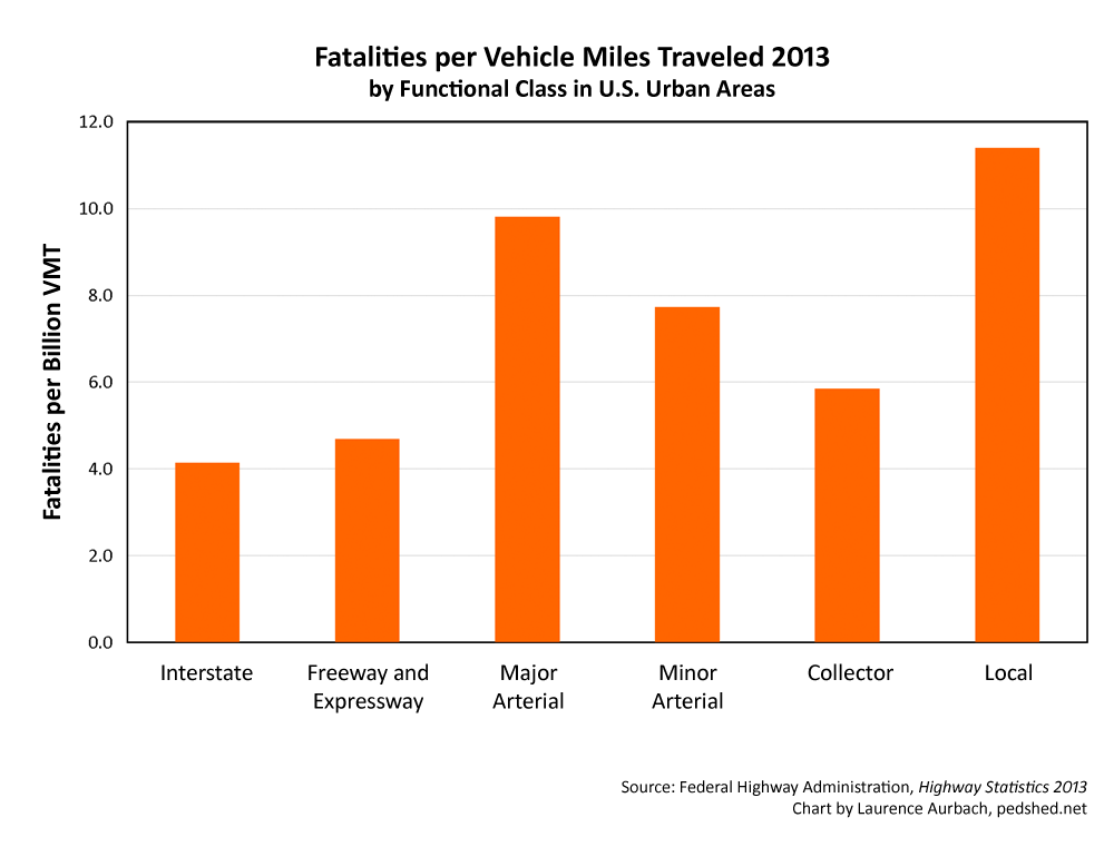
Chart 2: Fatalities per VMT by functional class
Chart 2 confirms the mainstream view. Interstates are the safest facilities and local streets are the most dangerous. But is that view truthful? Actually, the official statistics contain a critical logical flaw. VMT (that is, travel distance) is the product of speed and time. Therefore speed is fundamentally intertwined in the fatalities-per-VMT metric. The way the variables are related produces the following outcome. For any given amount of travel time, and assuming identical roads and drivers, the fatalities-per-VMT metric will always report that faster speed is safer (see Appendix 1).
But that’s opposite to basic physics and everything we know from traffic safety research. Faster speed is more dangerous on most roadways, and it’s certainly more dangerous on full-access urban streets and arterials. Does a better metric exist?
Suppose we show the crash fatality rates in terms of fatalities per roadway miles. That metric would not be based on travel; it would be based on physical, tangible roadways. The chart based on that metric looks like this:
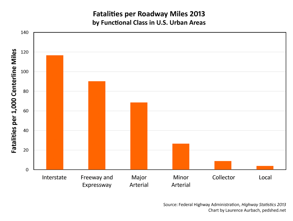
Chart 3: Fatalities per roadway miles by functional class
By that metric, local streets are the safest roadway type by a lopsided margin. Interstate freeways are 30 times more dangerous! The risk profile is thoroughly unlike that of the fatalities-per-VMT metric.
How can this chart and the previous chart be so completely different? And which metric is more truthful? One chart measures risk in terms of miles of driving; the other measures risk in terms of physical miles of roadway. Neither statistic represents the actual risk well. Both are biased by a highly skewed dataset: the functionally classified roadway system illustrated in Chart 1. In the case of fatalities per roadway mile, the class of local streets has by far the most mileage of all the roadway classes. So when the number of fatalities is divided by that large number of roadway miles, the metric will show “lower class” local roads to be the safest.
To construct a better metric, we can take guidance from the fields of public health and environmental science and use exposure time. Traffic fatality risk can be measured as fatalities per hour of exposure. The problem with that is we don’t know how much time vehicles spend on each functional class of roadway. But if we know the average speed on each functional class of roadway, we can make an estimate.
From a study of vehicle activity patterns in California (Barth et al. 2007), I have derived the average speed on each functional class of roadway (see Appendix 2).
Urban freeway: 42 mph
Urban arterial: 33 mph
Urban collector: 32 mph
Urban local: 25 mph
With this information we can construct a metric. The miles driven can be divided by speed to produce hours of exposure. (In other words, distance / rate = time.) The chart based on that metric looks like this:

Chart 4: Fatalities per vehicle hours by functional class
The chart is roughly similar to the fatalities-per-VMT chart, but it has notable differences. Based on each hour of exposure, major arterials are the most dangerous facilities and local streets the second-most dangerous. Collector streets are about as dangerous as freeways. The spread between the various roadway classes is smaller than that of the other metrics.
The fatalities-per-vehicle-hour metric is good for understanding the risk of an hour of travel. However, the story doesn’t end there. An hour of travel on street A might be more dangerous than an hour of travel on street B. But if you spend many more hours traveling on street B each year, then you’ll be exposed to more risk on street B each year. The number of hours we as a nation spend on any particular roadway type is affected by our cultural patterns — factors like cultural preferences, government policies, infrastructure investments, suburban sprawl, provision of mass transit, and so on.
The standard metric for representing health or accident risk for a community or society is adverse events per capita. Because the urban population is constant for national-level traffic-fatality statistics, the fatalities-per-capita metric is equivalent to the raw fatality statistics. In short, the raw fatality statistics represent America’s systemic risk on an annual basis. A chart based on those statistics looks like this:
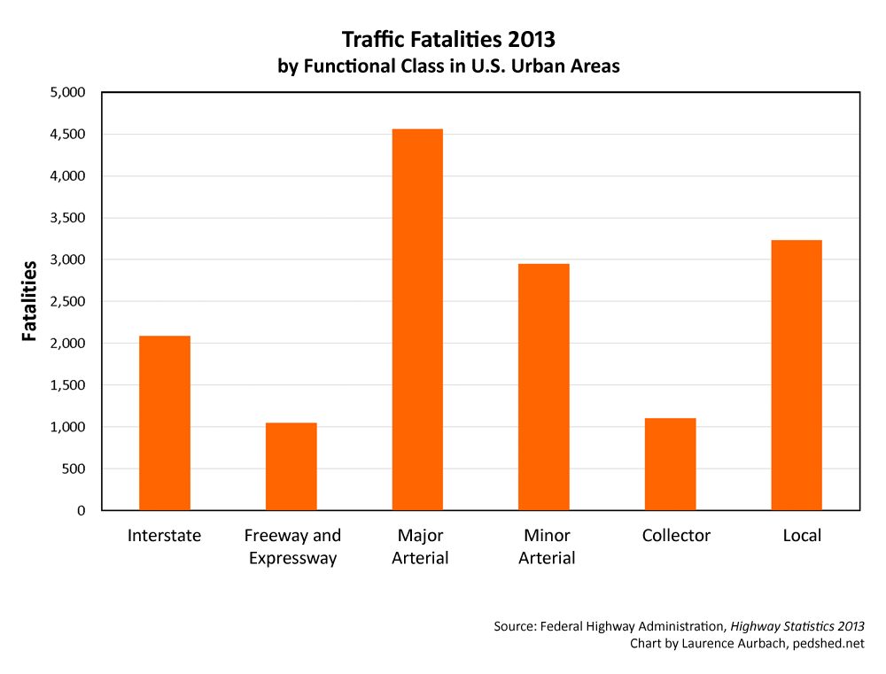
Chart 5: Fatalities by functional class
Major arterials have the most fatalities and local streets the second most. These statistics are not adjusted for exposure, so they can be added together to form a clearer picture of the risk profile. Interstates+freeways+expressways has almost as many fatalities as local streets. Major+minor arterials has more than twice as many fatalities as local streets. On an annual basis, therefore, local streets are not at all the most dangerous type of roadway.
Another way of representing the national systemic risk is to sort the roadways by posted speed limit. A chart that uses that sorting looks like this:
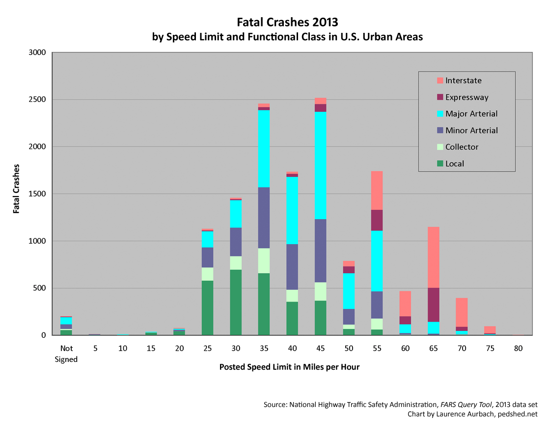
Chart 6: Urban fatal crashes by speed limit and functional class. This chart shows fatal crashes, rather than fatalities, due to the limits of the FARS online query tool. Six percent of urban fatal crashes lack speed limit information and are not represented on this chart.
This chart illustrates the powerful role of speed in annual crash risk. Urban streets signed for 5-20 mph have a low annual risk of crashes. Freeways and arterials signed for 75-80 mph also have a low annual risk of crashes, partly because few roadways have such high speed limits. The largest number of crashes occur on roadways signed for 35-55 mph, especially major and minor arterials.
Twenty-two percent of urban fatal crashes occur on urban local streets. Nine percent of urban fatal crashes occur on urban local streets signed for 30 mph or less. (Six percent of urban fatal crashes lack speed limit information and are not included in those figures.) On an annual basis, your chances of being in a fatal crash are much greater on the faster, “high-class” streets, arterials, and highways.
Conclusion
The fatalities-per-VMT metric is logically absurd and inappropriate for policy decisions. State and federal governments continue to use it because the collection of VMT statistics, after many decades of practice, is a generally well-understood and routine process.
The fatalities-per-capita metric is best for comparing the systemic traffic risk of communities, states, and nations.
The fatalities-per-exposure-hour metric is best for comparing the traffic risk of individuals. It also allows comparisons between modes that are otherwise difficult to compare, like walking and bicycling. It is rarely used because data about exposure time on functional classes of roadways is hard to obtain. However, GPS tracking is now installed in nearly all new cars. Vehicle tracking by cell phones, electronic toll passes, and other methods is developing and becoming more common. The collection of average-speed or exposure-time information may already be feasible for national statistics and eventually may become as routine as the current process of estimating VMT.
The magnitude of such a reform task should not be underestimated. A nationwide, multiyear administrative effort would be required to change the procedures in every state. Various agencies, associations, and research groups would need to develop the methodological details, and the federal government would have to coordinate the implementation. The task would be great but the benefits could make it worthwhile.
Credible and truthful metrics should be used when making comparisons between different roadway classes and their geometric designs, speeds, and urban contexts. Our national policies about roadway design and layout should be informed by better safety metrics.
Appendix 1
The report “Motor Vehicle Occupant Fatality Risk Based on Person-Time Exposed: Age, Sex, and Period of Week,” by C. Craig Morris presents several equations that reveal logical flaws in the fatalities-per-VMT metric. Equation 1 is the general definition of risk.
(1) adverse events / exposure = risk
Equation 1 is translated into the transportation context to produce Equation 2. According to Morris, all the common measures of transportation fatality risk exposure are a function of person time.
(2) fatalities / person time = risk
Both sides of the equation are divided by speed to produce Equation 3.
(3) fatalities / person distance = risk / speed
Finally, both sides of the equation are multiplied by vehicle occupancy to produce Equation 4.
(4) fatalities / vehicle distance = (vehicle occupancy by distance / speed) x risk
This is equivalent to the fatalities-per-VMT metric. Speed is in the denominator, so the higher the speed, the lower the risk. The variation of vehicle occupancy by distance is unknown; surveys suggest all but a few vehicles carry 1 or 2 occupants.
Appendix 2
In order to estimate the average speed of roadway functional classes, I derived speeds from the 2007 study “Analysis of GPS-Based Data for Light Duty Vehicles” by Barth, Zhu, Boriboonsomsin, and Ordonez. The study used two GPS vehicle activity data sets collected from Californian households in 2001. The data sets recorded the activity of 1,040 cars making 8,965 trips and traveling 44,235 miles.
I derived speeds from Table 4.3 (p. 24) with the following assumptions and methods:
1. I assumed nearly all of the data was recorded within urban areas. The maps on pages 17-19 suggest that is so.
2. Tiger/Line categories were translated to Highway Performance Monitoring System categories as follows: A1 = freeway, A2 = arterial, A3 = connector, A4 = local street. See page 8 for a description of Tiger/Line categories.
4. I was unsure how to allocate A6 roadways to the Highway Performance Monitoring System categories, so I omitted that category. In the study, 8-10 percent of vehicle time was spent on on A6 roadways. A fraction of 1 percent of vehicle time was spent on A5 and A7 (off-road trails and paths). Those categories were omitted too.
3. The Northern California and Southern California average speeds are combined using a time-based weighted average. See Table 4.2 on page 21 for time data by roadway type.
Please note this study was the best source I was able to find related to the average speed on roadway functional classes. If better sources exist I will be interested to learn of them.
Acknowledgements
Thanks to C. Craig Morris at the Bureau of Transportation Statistics, U.S. Department of Transportation. Mr. Morris helpfully explained some of the principles in his research report on traffic fatality risk.
Much gratitude to Kanok Boriboonsomsin, associate research engineer at the Center for Environmental Research and Technology, University of California, Riverside. Professor Boriboonsomsin gave valuable feedback about my derivation of average speeds on roadways and suggested the weighting method to average two data sets.
Sources
Barth, Matthew, Weihua Zhu, Kanok Boriboonsomsin, and Luis Ordonez. “Analysis of GPS-Based Data for Light Duty Vehicles.” Report prepared for California Air Resources Board, contract no. 04-327 UCR, January 2007.
Chu, Xuehao, “The Fatality Risk of Walking in America: A Time-Based Comparative Approach.” Walk21 IV Proceedings, Walk21 IV: Health, Equity & Environment, Portland, OR, 1-3 May 2003.
European Commission. “Speed and Accident Risk” (web page). European Road Safety Observatory, October 2016.
Hakkert, A.S. and L. Braimaister. “The Uses of Exposure and Risk in Road Safety Studies.” Report R-2002-12, SWOV Institute for Road Safety Research, The Netherlands, 2002.
U.S. Department of Transportation. Bureau of Transportation Statistics. “Motor Vehicle Occupant Fatality Risk Based on Person-Time Exposed: Age, Sex, and Period of Week.” Technical report by C. Craig Morris, June 2015.
U.S. Department of Transportation. Federal Highway Administration. Highway Statistics 2013 (online document), 2014.
U.S. Department of Transportation. National Highway Traffic Safety Administration. Fatality Analysis Reporting System (FARS) Encyclopedia Query Tool (online database), 2013 data set.
Wundersitz, LN, and TP Hutchinson. “Identifying and Improving Exposure Measures.” Report CASR053, Centre for Automotive Safety Research, The University of Adelaide, December 2008.
Excellent work my friend. This is national news. I feel most vulnerable on higher speed arterial streets. Simple physics tell us the energy is absurdly high, our ability to stop extremely low and the potential of conflicting with another vehicle’s path is high.
Unfortunately, the excitement of driving derives from its more dangerous elements.
You have displayed the cost of high speed mobility.
Thanks
Thanks, Rick. Your comment hits the nail on the head. Why are we funneling all traffic onto huge arterials in the name of safety if they’re more dangerous than local streets? Some will say we just need stricter access management on arterials. But the safety record in 2013 comes after 30 years of official access management rules. It’s time for a different safety model: the walkability model.
Can you tell me if I’m correctly understanding the “Fatalities per Vehicle Hours – 2013” graph?
Using the annual VMT per roadway class data from the Functional System Travel table (https://www.fhwa.dot.gov/policyinformation/statistics/2013/vm2.cfm), you used average speed on each of those classes of roadway to determine how much time is needed to travel each distance. Then, you used quantity of fatalities per roadway type data (where did that come from? I don’t see it on FARS – though I’m still getting comfortable with the query tool) to determine fatalities-per-vehicle-hour by roadway class.
One minor point on the last speed limit chart. There are very few streets signed at slow speeds, so the sheer lack of roadway miles might result in an artificially low number. If you controlled for roadway miles, you might get a different result.
Ryan, the FHWA Highway Statistics table FI-20 reports fatalities by functional class.
Corey, yes, slow streets are less common than 25-70 mph urban roadways. However, quite a few cities and states have slow zones around schools, in alleyways, and in other business and residential areas. See the Summary of Speed Laws and this post about Portland and Seattle. National data about the mileage of roadways signed for different speeds would be helpful. If anyone can find that, please tell me about it.
That being said, there’s nothing artificial about the chart and I stand by my assertion that it’s an accurate reflection of our national systemic fatal-crash risk on an annual basis.
Thanks for linking to this in your recent Strong Towns post. While I generally agree with your overall conclusion I do have a question regarding the conclusion reached in Appendix 1. Equation 4 is not solved for risk as it shown. Had it been solved for risk would speed not then be the numerator and the opposite conclusion reached? What am I missing? Please help.
Jason, all the equations in Appendix 1 are expressions of the same relationship. They are dissimilar only in the variables that have been added to each side of the equations to keep them in balance. If you solve Equation 4 for risk, that will simply take you back to Equation 2.
The equations in C. Craig Morris’s paper are arranged slightly differently, so take a look and see if you find them more clear.
I don’t think your first conclusion regarding stating that “fatalities-per-VMT metric is logically absurd” is logically sound.
You state that “All else being equal, the fatalities-per-VMT metric will always report that faster speed is safer (see Appendix 1).” I agree with that statement. If fatalities per functional class are constant, then the class with the highest speed will be reported as safer, since it will reduce the exposure to risk by completing a trip in less time. I do not think that the metric is biased towards higher speeds based on this, it’s simply a reduction in exposure.
You also state that this is a critical logic flaw when using fatalities-per-VMT, since it is “opposite to basic physics and everything we know from traffic safety research”, however I do not believe that they oppose each other. Basic physics and traffic safety research (the link of which is broken) shows us that vehicles traveling at higher speeds which are involved in crashes are far more likely to have fatalities. The flaw when applying this logic to ALL high speed travel is that this only speaks to the severity of crashes at higher speeds when they actually occur, and does not take into account their rate of occurrence. While fatality-per-VMT and crash severity based on speed both allow us to determine risk, they are not the same risk. I think the fact that the data set only included fatalities, and doesn’t included lower severity crashes, is already adjusted for this increased crash severity risk.
(Fabricated numbers to illustrate my point) – If a fatality is 10 times more likely to occur IF a crash occurs on an interstate compared to a local road, and if the overall crash rate is more than 10 times less on an interstate compared to a local road, the overall “fatality risk” is lower on the interstate. I think the conclusion that the interstate is “safer” (less fatality risk per VMT) is still sound, since a fatality is overall less likely on the interstate. If a crash occurs, the fatality risk is higher on the interstate, but the overall fatality rate is lower due to the lower crash rate.
Also, I agree with Corey that Chart 6 really needs to be adjusted for roadway miles or VMT. If you are saying that “Urban streets signed for 5-20 mph have a low annual risk of crashes” without adjusting for miles or exposure, you could just as easily point out that “local urban roads signed for 60 mph+ have a near zero annual risk of crashes” and conclude they are the safest, when clearly the obvious explanation for that is that there are very few, if any local urban roads signed for 60 mph.
Anyway, I enjoyed the post and found it thought-provoking. I certainly don’t believe fatalities-per-VMT is the absolute best statistic to use, but I think it’s more useful than you give it credit in this post and I think it may be the best “simple” statistic we have.
Andrew, thanks for pointing out the broken link. I’ve fixed it so people can visit the page and see a brief summary of speed-related research. In response to your comments:
1) Higher speed does cause higher crash risk — that is, a higher risk that a crash will occur. As the EU Speed and Accident Risk page points out, higher speed gives people less time to react. Higher speed also lengthens braking distance. The relationship between speed and crash risk is not linear; it is a power function. The higher the speed, the steeper the risk curve.
2) In regard to your first statement about fatalities per VMT: If fatalities per functional class are constant, then the “safer” functional classes will be the ones with more VMT. But that doesn’t give you clear information about the risk per hour of exposure. For example, freeways and collectors had about the same number of fatalities in 2013. Freeways were a little safer than collectors in terms of fatalities per VMT. But freeways were a little more dangerous than collectors in terms of fatalities per vehicle hour. Why? Because speed is only one of several factors that influence the VMT of a functional class.
You wrote, “I do not think that the metric is biased towards higher speeds based on this, it’s simply a reduction in exposure.” Yes, the time per trip is reduced by higher speed. But that’s different than the risk per hour of exposure. If fatalities and VMT per functional class are constant, which means the faster class has fewer vehicle hours, then fatalities per vehicle hour is increased by higher speed — not reduced.
I’ve changed the text to read, “For any given amount of travel time, and assuming identical roads and drivers, the fatalities-per-VMT metric will always report that faster speed is safer.” I think that’s more accurate than the vague statement I wrote initially (“all else being equal”).
Also, when people can drive faster, they usually drive farther too, and the total amount of time spent driving changes little. So in practice, faster speed tends not to reduce exposure time.
3) The purpose of reporting statistics like those in Chart 6 is to gain an understanding of systemic annual (or lifetime) risk. If it was adjusted for VMT, that particular understanding would be lost. Let me offer an analogy. Thirty minutes in a lightning storm is much more dangerous than 30 minutes in a bathtub. But on an annual basis, many more people are injured and killed in bathtubs than in lightning storms. If we want to make the biggest reductions in the number of people injured and killed, if we want to determine priorities for safety steps, that’s important information to have.
All the analysis seemed to only consider the exposure of drivers or car passengers. Not the perspective of pedestrians, for whom “crashes per VMT” would be irrelevant, and also who can’t die on freeways they’re not allowed on.
Also, I feel the low “crashes per VMT” might be exaggerated by long distance trips, similar to the apparent high safety per mile of airline travel.
drs, I think we are generally on the same page. The injuries/deaths per VMT metric is logically absurd and invalid because it makes faster-speed modes appear safer, even if they are not safer in terms of risk exposure. So how should we measure the safety of walking, cycling, and other active-travel modes? It depends on the purpose of measuring — that is, what one is trying to achieve.
1) In order to compare the safety of different travel modes, injuries/deaths per hour of travel is the most logical and defensible metric. That’s because it measures safety directly in terms of exposure to risk.
2) The injuries/fatalities per capita metric is best for comparing the systemic risk of transport systems at the scale of communities, states, and nations.
3) For places that want to create rules and infrastructure investments in order to achieve Vision Zero goals, a simple raw count of injuries/deaths might be the most useful metric.
4) I disagree with you on one point: pedestrians on highways. A sizable number of people die on highways while on foot. That includes walkers who legally aren’t allowed to be there, but it also includes people who must be there, such as maintenance and utility workers, people whose vehicles break down, and emergency responders. In fact, the state in which I live (Maryland) passed a “move over” law to protect such people.